Thought of the Week - what makes a market 'look risky'?
By Joachim Klement, Head of Strategy
A couple of months ago, I wrote a post about research that examined what we look at when we look at price charts. In an independent study that could be considered a follow-up (at least when it comes to me writing a post), Xindi He and Yucheng Liang quantified some of these perceptions and showed how they influence our perception of the riskiness of an investment.

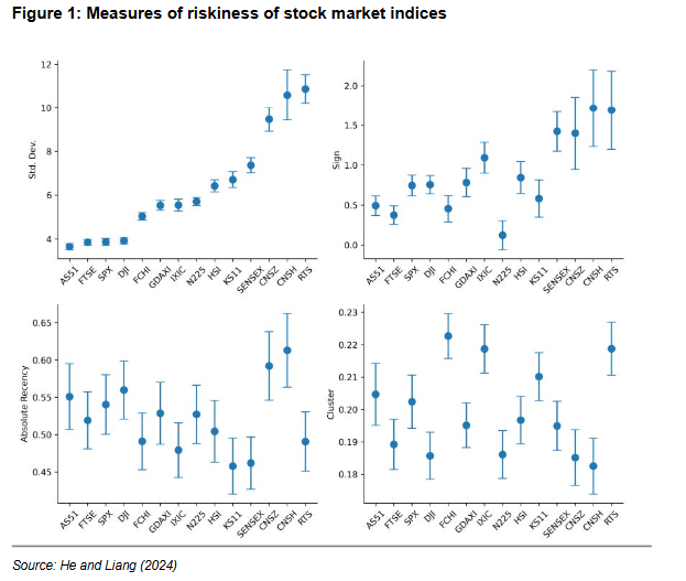
In a series of experiments with artificial stock price charts, they showed that investors’ assessment of the riskiness of an investment is driven in large part by three factors: sign, clustering and recency. Firstly, sign simply measures how often in the past the share price or index has gone up vs. gone down. You want this indicator to be as large as possible, indicating that the index has gone up more often than down.

Secondly, clustering measures how much positive and negative returns are clustered together. The experiments show that if (positive and negative) returns are more bunched up in clusters, the investment is perceived as riskier. After all, if you invest at the wrong time, you may face an extended period of steeper and steeper losses. It’s just loss aversion in practice.
Thirdly, recency measures the obvious. The better the most recent returns of the investment, the more attractive it looks and the less risky it seems to be. To the left is a chart of a range of global stock market indices sorted from least volatile on the left to most volatile on the right, based on monthly data from 1990 to 2021. Traditional finance theory holds that volatility is a measure of how risky an investment is, but it takes one look at the subjective measures of risk to notice that volatility has absolutely nothing to do with how risky we perceive an investment to be.
More articles by Joachim Klement:
The curious case of cross-country factor momentum


